FINERY
Ux, UI, Visual Design

Company:
Finery is a wardrobe management system that imports users' purchases to allow them to organize their wardrobe and plan outfits.
Role:
Design Lead -- I led a team of 5 designers and worked directly with the head of marketing to meet business goals. My personal design focus was the calendar feature.
Objective:
Design a responsive web dashboard with the aim of increasing the frequency of the platform's key action -- look creation.
Background

Current Finery user homepage
let's get personal
Finery offers a wealth of features, leaving their key function (creating looks) to be lost in the noise.
To highlight this core functionality and increase its frequency, our team had the following goals:
- Create a personalized dashboard for all of a user's content.
- Design an outfit calendar feature to enable users to schedule looks.
- Document a design system to ensure the seamless integration of the new dashboard.
new dashboard, who dis?
This project had the benefit of an existing userbase. We knew there existed two basic segments we were designing for:

The Wardrober
Links their account and builds looks from their own wardrobe and wishlist.

The Wishlister
Does not connect their accounts, and uses Finery for inspiration.

Finery email account connection
Design
Time is a factor
Initially, we were viewing the dashboard as a 'snapshot,' and had planned to show the outfits upcoming five days into the future.
BUT, user testing revealed some concerns.
“What if I want to see what I wore last week so I don’t repeat?”
“How do I plan farther out for an upcoming event?”
Valid points. So, as Ross famously said, 'PIVOT!'

Initial component sketches of the outfit planner
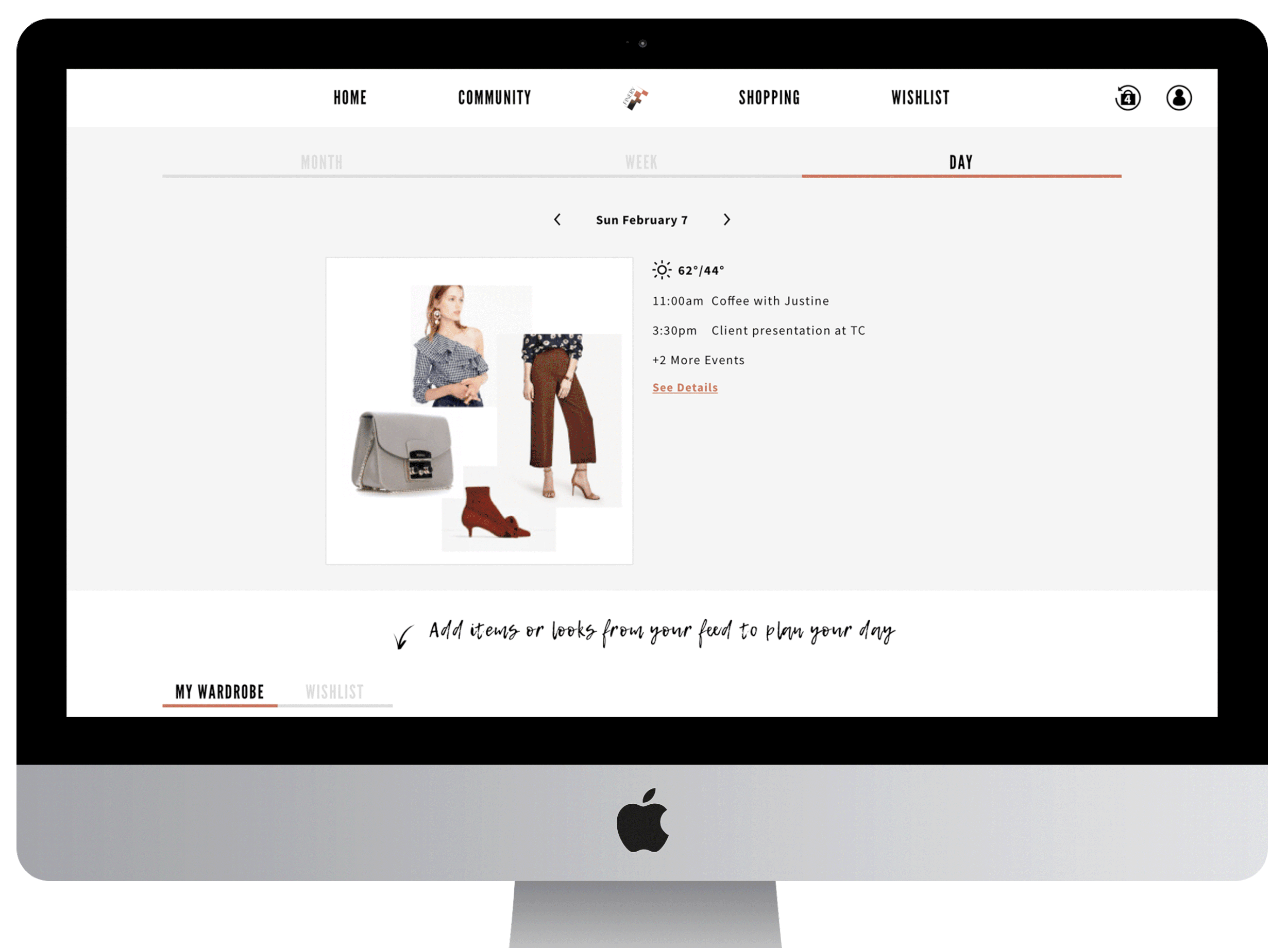
I ran another design studio sketching session, and we landed on three display options: month, week, and day. This makes it easier to get varying levels of detail, and to quickly preview days in the future.
The calendar was my personal design focus, so I took our sketches and translated them into lo-fi screens:

As week is the default view, I first tried to jam too many details into the screen (see the low-fidelity mobile screen above). After usability testing on mobile, I reality-checked myself and reserved event details for the Day view.
For the Month view on desktop I took advantage of the extra real estate and incorporated look previews.
Filling the feeds
Wardrobers need practical planning: to add their wardrobe directly into looks or into the calendar.
Wishlisters need aspirational planning: add their wishlist items, bookmarked looks and inspirations into the calendar.
Creating three feed themes (items, looks, inspiration) ensured both users had content in each feed:

Cooking up the look book
While looks and inspiration can immediately be added to the calendar, items required additional thought.
In order for users to start a look directly from their item feed, we opted for a multiple select option.
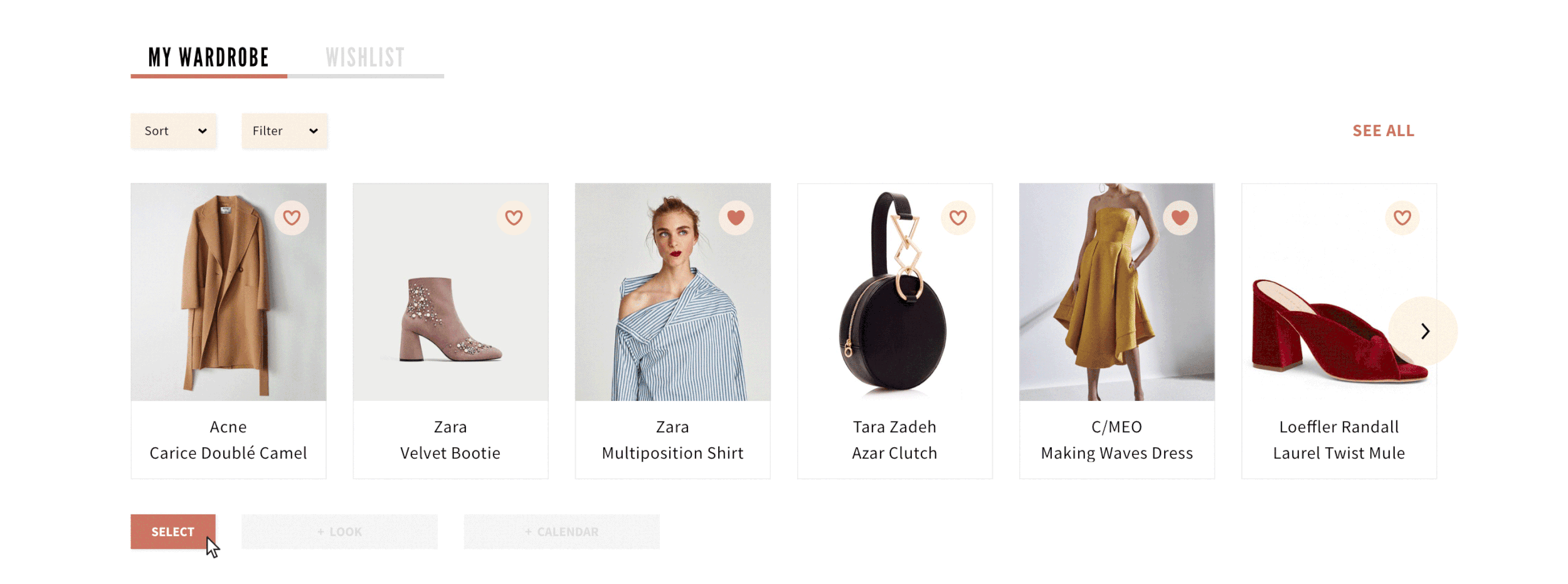
Users can then edit their look and save it or simply add it to the calendar immediately:


Design System
refining finery
Finery, having had features continuously added since its launch, has an expansive range of components.
I wanted to ensure that this project matched Finery's look and feel, but also wanted to create a design system in order to make the entire platform more cohesive. The team performed a component audit, combing the entire site, and then created a grid, typography guide, color palette, and component library.


What's Next?

Build me up, buttercup
These designs were met with excitement from both the San Francisco and New York Finery office.
Finery is currently undergoing a redesign and will be putting these designs into production within the next 6 months.
Client Feedback:
“She was a top notch designer and project manager who delivered thoughtful, innovative solutions for our user. Her team kept our business objectives at the forefront of every design decision”
Want to learn more about this project?